top of page
GRAPHIC DESIGN



Social Media


Social Media


UTM GLOBAL BRIGADES
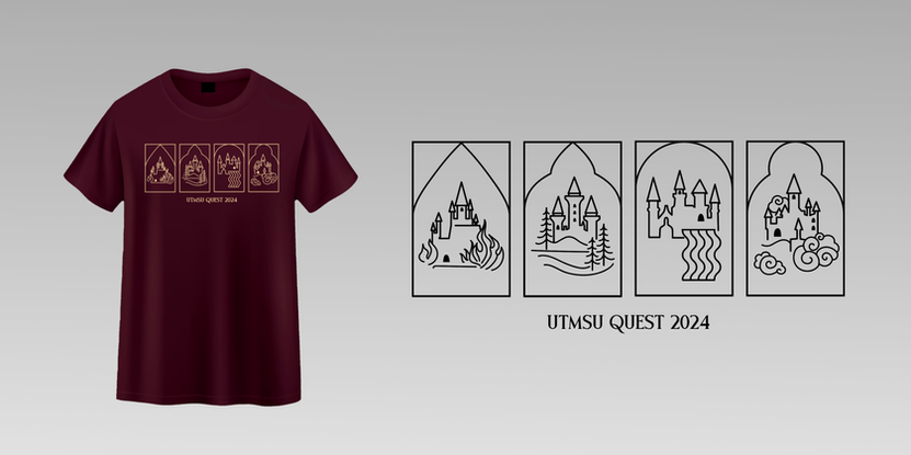
All original vector art. Themes are based on season.


Infographics
INFOGRAPHICS
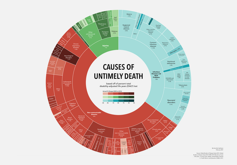
REDESIGN: CAUSES OF UNTIMELY DEATH
When original graphics don't show the whole picture, sometimes it helps to take it into your own hands.

ORIGINAL:
THE 100
Fanlore meets infographics. Based on the apocalyptic science-fiction show The 100, this infographics maps out all seasons of the show. From leadership to alliances, battles and major events of the show, this infographic tries bring out the intricate show out onto one spread.


REDESIGN:
MINARD'S MAP
The original is iconic for a reason. So many variables all put together in one map. This new version takes the same data and reformats it to tell the story of Napoleon's army decline in an almost narrative way.

REDESIGN: CAUSES OF UNTIMELY DEATH
When original graphics don't show the whole picture, sometimes it helps to take it into your own hands.

ORIGINAL:
THE 100
Fanlore meets infographics. Based on the apocalyptic science-fiction show The 100, this infographics maps out all seasons of the show. From leadership to alliances, battles and major events of the show, this infographic tries bring out the intricate show out onto one spread.


REDESIGN:
MINARD'S MAP
The original is iconic for a reason. So many variables all put together in one map. This new version takes the same data and reformats it to tell the story of Napoleon's army decline in an almost narrative way.

REDESIGN: CAUSES OF UNTIMELY DEATH
When original graphics don't show the whole picture, sometimes it helps to take it into your own hands.

ORIGINAL:
THE 100
Fanlore meets infographics. Based on the apocalyptic science-fiction show The 100, this infographics maps out all seasons of the show. From leadership to alliances, battles and major events of the show, this infographic tries bring out the intricate show out onto one spread.


REDESIGN:
MINARD'S MAP
The original is iconic for a reason. So many variables all put together in one map. This new version takes the same data and reformats it to tell the story of Napoleon's army decline in an almost narrative way.

REDESIGN: CAUSES OF UNTIMELY DEATH
When original graphics don't show the whole picture, sometimes it helps to take it into your own hands.

ORIGINAL:
THE 100
Fanlore meets infographics. Based on the apocalyptic science-fiction show The 100, this infographics maps out all seasons of the show. From leadership to alliances, battles and major events of the show, this infographic tries bring out the intricate show out onto one spread.


REDESIGN:
MINARD'S MAP
The original is iconic for a reason. So many variables all put together in one map. This new version takes the same data and reformats it to tell the story of Napoleon's army decline in an almost narrative way.

REDESIGN: CAUSES OF UNTIMELY DEATH
When original graphics don't show the whole picture, sometimes it helps to take it into your own hands.

ORIGINAL:
THE 100
Fanlore meets infographics. Based on the apocalyptic science-fiction show The 100, this infographics maps out all seasons of the show. From leadership to alliances, battles and major events of the show, this infographic tries bring out the intricate show out onto one spread.


REDESIGN:
MINARD'S MAP
The original is iconic for a reason. So many variables all put together in one map. This new version takes the same data and reformats it to tell the story of Napoleon's army decline in an almost narrative way.

REDESIGN: CAUSES OF UNTIMELY DEATH
When original graphics don't show the whole picture, sometimes it helps to take it into your own hands.

ORIGINAL:
THE 100
Fanlore meets infographics. Based on the apocalyptic science-fiction show The 100, this infographics maps out all seasons of the show. From leadership to alliances, battles and major events of the show, this infographic tries bring out the intricate show out onto one spread.


REDESIGN:
MINARD'S MAP
The original is iconic for a reason. So many variables all put together in one map. This new version takes the same data and reformats it to tell the story of Napoleon's army decline in an almost narrative way.

REDESIGN: CAUSES OF UNTIMELY DEATH
When original graphics don't show the whole picture, sometimes it helps to take it into your own hands.

ORIGINAL:
THE 100
Fanlore meets infographics. Based on the apocalyptic science-fiction show The 100, this infographics maps out all seasons of the show. From leadership to alliances, battles and major events of the show, this infographic tries bring out the intricate show out onto one spread.


REDESIGN:
MINARD'S MAP
The original is iconic for a reason. So many variables all put together in one map. This new version takes the same data and reformats it to tell the story of Napoleon's army decline in an almost narrative way.

REDESIGN: CAUSES OF UNTIMELY DEATH
When original graphics don't show the whole picture, sometimes it helps to take it into your own hands.

ORIGINAL:
THE 100
Fanlore meets infographics. Based on the apocalyptic science-fiction show The 100, this infographics maps out all seasons of the show. From leadership to alliances, battles and major events of the show, this infographic tries bring out the intricate show out onto one spread.


REDESIGN:
MINARD'S MAP
The original is iconic for a reason. So many variables all put together in one map. This new version takes the same data and reformats it to tell the story of Napoleon's army decline in an almost narrative way.

REDESIGN: CAUSES OF UNTIMELY DEATH
When original graphics don't show the whole picture, sometimes it helps to take it into your own hands.

ORIGINAL:
THE 100
Fanlore meets infographics. Based on the apocalyptic science-fiction show The 100, this infographics maps out all seasons of the show. From leadership to alliances, battles and major events of the show, this infographic tries bring out the intricate show out onto one spread.


REDESIGN:
MINARD'S MAP
The original is iconic for a reason. So many variables all put together in one map. This new version takes the same data and reformats it to tell the story of Napoleon's army decline in an almost narrative way.

REDESIGN: CAUSES OF UNTIMELY DEATH
When original graphics don't show the whole picture, sometimes it helps to take it into your own hands.

ORIGINAL:
THE 100
Fanlore meets infographics. Based on the apocalyptic science-fiction show The 100, this infographics maps out all seasons of the show. From leadership to alliances, battles and major events of the show, this infographic tries bring out the intricate show out onto one spread.


REDESIGN:
MINARD'S MAP
The original is iconic for a reason. So many variables all put together in one map. This new version takes the same data and reformats it to tell the story of Napoleon's army decline in an almost narrative way.
SCIENTIFIC PRESENTATION BOARD DESIGN
Based on a scientific research article without graphic representation, a scientific presentation board was design, as used in research conferences.

BOOK DESIGN
BOOK DESIGN
ANBU PROGRAM MANUAL
All original illustrations and infographics. South Asian identity inspired.
Manual and workbook for group therapy for survivors of sexual violence.
THE BUCKET LIST
All original design. Natural adventure concept.
Planner for bucket list items with inspiring quotes & illustrations.
AWESOME ADVENTURES
All original illustrations. Fun, imaginative concept.
A children's book written by a child.
bottom of page


